Despite playing with the PITCHf/x data since the playoffs last season, I didn't have a very firm understanding on how the values were captured until earlier this week when I was alerted to Alan Nathan's fantastic website on the physics of baseball. The whole site is good, but I was particularly interested in the section on the PITCHf/x system. In addition to Nathan's analysis on pitch data, this section contains a treasure trove of general information about the system as well as specific definitions for each data field. Using several of Nathan's equations, I was able to quantify where a pitch is in space at any time from release until it reaches home, and using these locations, I was able visualize the entire trajectory of each pitch, similar to what is shown for each pitch in the Gameday window.
The equation for finding the x position of a pitch is x(t)=x0+vx0*t+0.5*ax*t^2, where t is time, vx0 is the pitch's initial velocity in the x direction and ax is it's acceleration in the x direction. Vx0 and ax are provided in the xml, so finding the x coordinate of a pitch is as easy as plugging in a value for t. The y and z coordinates of a pitch are found using the same equation, but with the appropriate initial velocity and acceleration values. Here's the path of a Rich Hill curveball from July 21st.
Time(s) x y z0.00 1.31 50.00 6.760.05 1.24 44.78 6.810.10 1.15 39.61 6.770.15 1.02 34.49 6.620.20 0.86 29.42 6.380.25 0.67 24.40 6.030.30 0.45 19.43 5.580.35 0.19 14.52 5.040.39 -0.01 10.87 4.560.45 -0.40 4.84 3.630.49 -0.64 1.42 3.03
If I were really good I would have a 3 dimensional graph here, but it looks the same as the path they show in Gameday for the pitch. Each coordinate is measured in feet, with 0,0,0 being the back part of home plate and y=1.42 being the front of home plate. X measures left and right, from the catchers perspective, with negative numbers being on his left, y is the distance from the pitchers mound to home plate and z is vertical distance from the ground. This curveball ended in the high, inside quadrant of the strike-zone for a right-handed hitter.
The first thing I noticed in the chart is that the pitch reached the front edge of home plate in .49 seconds. Using radar guns to measure the velocity of a pitch is established practice throughout baseball, however, the speed of a pitch varies based on where the gun is aimed, so saying a pitch is 71 MPH doesn't really mean anything. Was it 71 MPH out of the pitcher's hand? Crossing the plate? "Fast" gun? "Slow" gun? You could get four correct, but different radar readings for the same pitch. What really matters is the time a batter has to react to a pitch. Saying Hill's curveball takes .486 seconds to travel from release point to home (from y=50 to y=1.417) while his fastball takes .387 seconds shows a clear, tangible difference between the pitches. For a rough comparison, a Joel Zumaya fastball takes around .353 seconds and a Tim Wakefield knuckleball takes .544 seconds to make the journey. I'm not sure which is more amazing, that Zumaya's fastball gets to the plate so fast, or that Wakefield's knuckleball, the slowest pitch in baseball, still gets to the plate in half a second.
Here's a list of the 10 pitches that have reached home fastest this season, along with the corresponding release point radar reading. (For simplicity, I only used pitches that were tracked for 50 feet, which is why Zumaya does not appear on the list.) Looking at the list and the rest of the fast pitches in my database, it appears that there might be a little bit of a park factor involved with the results, although the names are who you would expect.
Player Date Time(s) MPHJustin Verlander 7/15.3477 101.7Matt Lindstrom 7/24 .3479 99.6J.J. Putz 7/28 .3482 101.3Jonathan Broxton 7/15 .3488 99.6J.J. Putz 7/28 .3492 101.6J.J. Putz 7/28 .3492 101.5Matt Lindstrom 7/3 .3496 100.3Justin Verlander 7/15 .3497 100.8Matt Lindstrom 7/3 .3499 100.4Matt Lindstrom 7/24 .3500 99.4
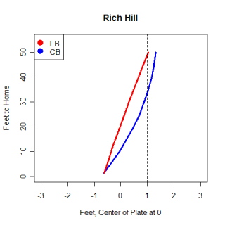
Getting back to Hill, graphing the trajectory of his fastball and curveball shows the differences in flight paths. This graph is drawn as if you were looking down from above, showing movement in the x-direction, with the release points at the top right of the graph and home plate in the bottom middle.

From the graph, you can see the different routes the pitches take. For the first 10 feet, Hill's curve looks very similar to his fastball, although after that the curve begins to break, moving away from left-handed hitters. The dotted line is a rough guess at the sight line for a left-handed hitter and illustrates how difficult it is for a left-handed hitter to hit a good curve from a left-handed pitcher. While both pitches begin at around the same location, the curveball actually goes behind a left-handed hitter's field of vision and appears that it will hit him for a split-second.
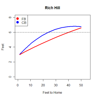
This graph is a side view of Hill's pitches, viewed from the first base line. Again the differences between the pitches are pretty clear to see, with the curveball taking a longer route to cover the same distance as the fastball. One thing to notice on this graph is that the curveball actually goes up after Hill releases it. It's not a big movement, but the pitch reaches it's maximum z-value .05 seconds after it has been released. On this graph the dotted line gives a rough idea of the eye level of a hitter and you can see that the curveball crosses the line much closer to home than the fastball does. I believe it is harder to look up and see a curveball that is above your eyes than it is to look down and see a fastball. Not only is the timing of a hitter thrown off by a curve, but where he's looking for the pitch is also thrown off.

There has been research done that shows the release points measured by the PITCHf/x system are not very consistent for different stadiums, so any research that uses the release point information needs to take that into account. However, according to Dr. Nathan's website, the only values in the xml files that are observed directly are the accelerations and initial velocities and positions, all of which are based of the release point. Every other value in the xml, including where the pitch crosses the plate and the break values, are calculated from those nine observed values. This opens the door to all kinds of problems if the release points are still as inconsistent as they were at the beginning of the year. This could also help explain the park factor I mentioned with times, because if the release point is slightly off it will directly impact the time calculations.
There are a number of cases where pitches are badly tracked, and another problem with the system is that it occasionally picks up a ball transfer between the umpire and pitcher. I haven't done any digging into this, so this is pure speculation, but knowing more about how the values are calculated, I think perhaps these two problems are related. If the initial values are somehow wrong (they correspond with the ball exchange), the x,y coordinates for where the ball crosses the plate are going to be calculated correctly for the ball exchange, but will not match the reality of the pitch.
********************
I referred to Alan Nathan's website countless times while I was writing this article and his kinematic equations are the basis for this article. I also want to thank him for helping answer some questions I had about the data and his equations. I highly recommend checking out his site, particularly his analysis on the PITCHf/x data.
Read More...
[Source: Baseball Analysts]
No comments:
Post a Comment